
CASE STUDY: VALLEY DIGITAL ACCOUNT OPENING
Valley is a 94-year-old commercial and retail bank with approximately $42 billion in assets. With over 230 regional branch locations in New Jersey, New York, Florida, and Alabama, and an employee base of nearly 3,800, Valley is undergoing widespread digital transformation.
Role UX Design Strategist · UX Researcher
Team Product Manager · Content writer · Engineering · QA
Deliverables User Stories · Prototype · Usability Testing
Tools Figma · InVision · Miro
Timeframe 3 months
Banking with Valley was proven difficult during the pandemic when customers lost the white-glove service they experienced in branches. As part of its growth strategy to reach a wider audience, enable customers to expand their relationship with Valley, and offer products that meet customer goals, Valley initiated new digital account opening experiences using an out-of-the-box solution with limited customizations.
Problem 1: Online Banking
Over 3,000 customers submit online banking applications per month, putting a strain on the customer care team.
Application processing requires one to four business days.
Customers don’t receive updates during the application review period.
Problem 2: Retail Account Opening
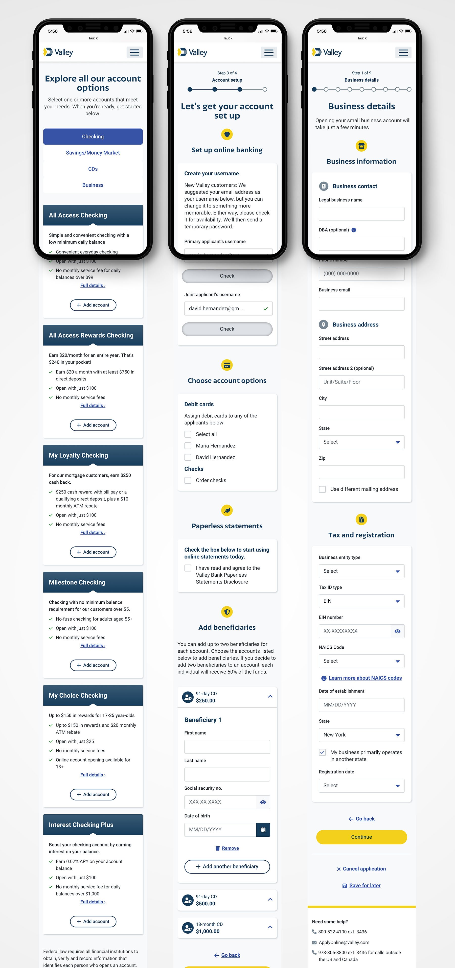
The current retail account opening experience comprises over 12 arduous steps that take over half an hour to complete. The technology is old, and opening an account with Valley still requires manual paper and review processes, which slows the time to account opening.
56% of users didn’t proceed beyond the first page of the old retail application.
The former account opening had a 2.5% conversation rate, ten times lower than leading competitors.
Only 1 in 3 customers have more than one active Valley account.
Problem 3: Business Account Opening
Opening commercial deposit accounts is a time-consuming and tedious process compared to retail accounts.
It can take one to two hours to open a small business account.
Opening a small business account must occur in a branch.
"How do we enable customers to self-serve and expand our products and services nationwide while growing our assets?"
BEFORE

Opportunity
Establish a digital account opening process that eliminates manual processes.
Shorten the time required to open accounts online and enable customers to simultaneously apply for multiple bank accounts.
Enable customers to verify their identity, select account amenities, and set up online banking during the account opening process.
Key Performance Indicators
Reduce annual customer care costs by $88,200.
Reduce the number of manually-processed online banking applications by 50%.
Increase the number of net new account openings.
Increase account opening conversions by 10x.
Reduce the length of time required to open an account online to 10 minutes.
PROCESS

DISCOVERY
Stakeholder Interviews
I partnered with UX Researchers and Product Managers to collect and synthesize analytical data and customer feedback that later informed design decisions.
Platform Analysis
As an out-of-the-box solution, the platform required a deep understanding of its component library.
Listening
Post-launch listening programs through exit-intent surveys and diary studies with the customer care team generate actionable feedback to iterate designs on an ongoing basis.
DEFINE
User Stories
To understand user tasks, I generated user stories through a series of workshops for all three account openings — two for retail and one for small businesses. The product, QA, and engineering teams used the user stories to define requirements and testing scripts.

IDEATE
I held bi-weekly UX workshops with product managers to define requirements and gather feedback on design concepts. These workshops involved some whiteboard and rapid prototyping.
VISUAL DESIGN
An agency initially started the visual design process, which I took over and established a design system and improved the look and feel. I designed Over 70 new screens (including mobile designs) with a cleaner interface and created prototypes for user testing. My team evolved Valley's design system, which we rolled out across the account opening streams in Q2 2023.

TESTING
I partnered with UX Researchers to test page flows for clarity, intuitiveness, and understanding of tasks. Testing mainly was successful, with some feedback suggesting clarity around language or labeling of instructions, buttons, and other UI components. I iterated on the designs based on user feedback.
1. Add Beneficiaries
Objective: Gauge how well users understand the process of adding beneficiaries to CDs.
Method: Unmoderated
Summary: Users find adding beneficiaries an intuitive and straightforward process with little friction, but it was not immediately apparent that the system added their beneficiaries to the CD. They prefer to actively save their designations or receive a confirmation that their input was successful.
"Clicking the drop down and adding the beneficiaries couldn't be any easier. It was seamless; it was quick; and it was really well organized."
"I do wish there was a save screen for the first beneficiary... something like a 'save' and 'add new.'"
"I'm looking for a save button. I'd rather have a save button than a continue button."
Design Strategy
Shorten the "Add beneficiaries" text below the headline to aid cognition.
Prevent errors by adding an "Add a beneficiary" CTA after the user opens the accordion.
Change the primary CTA label from "Add beneficiary" to "Add a beneficiary" to reinforce the singular action.
Change the secondary CTA label from "Add beneficiary" to "Add another beneficiary" to clarify the act of saving versus adding a new beneficiary.

2. FUNDING FRICTION
Summary: User feedback and insights from exit-intent surveys and Hotjar session recordings revealed customer drop-off at the funding section. Evidence of pain points appeared when users encountered errors after skipping the funding area or attempting to link a bank account. We hypothesized that the language and required tasks weren't straightforward.
Design Strategy
Improve cognitive load by reducing the amount of text and adding numbered icons to each section to guide user behavior.
Improve error messages language to help users recover from roadblocks.
Ensure front-end build has field placeholders as specified in the design.

RESULTS
Valley Direct received $1.2 million in deposits post-launch.
Valley Direct account opening received a 150% increase in new customers to Valley, realizing a 20% conversion rate goal.
Valley.com retail account opening conversion rate increased from 2% to 11%, with an average deposit of $5,845.
Valley Direct/Valley.com retail online account opening process reduced from 12 to 4 steps.
Small business account opening successfully launched.
Lessons Learned
Despite initial opposition, creating user stories was highly valuable for the broader team to collaborate, practice user-centered design, and define functionality.
Documentation is essential for ensuring all players are communicating.
Quality control is complicated with outsourced dev and QA resources.
Users don’t typically read content — especially during testing. Therefore, it’s essential to keep UX writing as concise as possible.
User testing only captures happy paths, not all scenarios that generate friction.