

PROBLEM
Weill Cornell Medicine is one of the largest physician groups in the New York metropolitan area. Until 2019, potential and existing patients could schedule a doctor's appointment only by making phone calls directly to the departments.
Making appointments via the phone is time consuming for patients and not an efficient utilization of resources.
SOLUTION
Incorporate an online appointment scheduling system on Weill Cornell Medicine’s Patient Care site.
TEAM
(1) Lead UX Designer / Researcher ** my role
(my role: user research, user flows, wireframes, prototype)
(1) Product Manager
(1) Engineer
(1) UX writer
TASKS / UX STRATEGY:
understand business & functional requirements
competitive analysis
empathy map
design user flow(s)
wireframes
high fidelity prototype
usability testing
I completed competitive research from peer institutions including NYU and MSKCC and interviewed (1:1 + survey) prospective patients on how they would expect to make an appointment with their specific criteria in the most efficient way possible.
FUNCTIONAL requirements
Actionable search results - ability to schedule appointment directly from search results for new and existing patients
Display doctors availability
Display doctors' contact information
Location-based Search
Auto-suggestion (predictive search, etc)
Pre-filter search (by: specialty, location, insurance, new/existing patient)
BUSINESS REQUIREMENTS
Increase traffic to Weill Cornell Medicine’s Patient Care site by at least 75%
Increase Book an Appointment conversion rate
Decrease number of steps to Book an Appointment
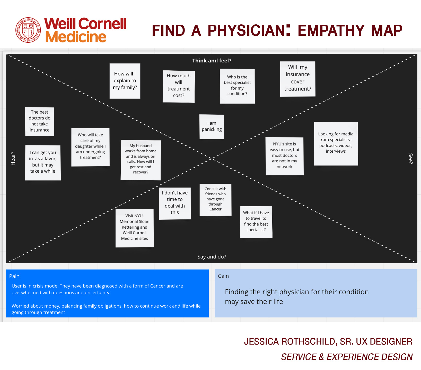
An empathy map is a collaborative visualization used to articulate what we know about a particular type of user. It externalizes knowledge about users in order to 1) create a shared understanding of user needs, and 2) aid in decision making. must we deeply understand our users, but we must also help our colleagues understand them and prioritize their needs.

user flow

*** New patients and existing patients book appointments through two different paths ***
SEARCH RESULTS — WIREFRAMES


Accommodating two user flows
1. Display time slots for new patients at all time
2. Existing patients can access availability with the help of "I have already seen this physician" button
LOCATION BASED SEARCH
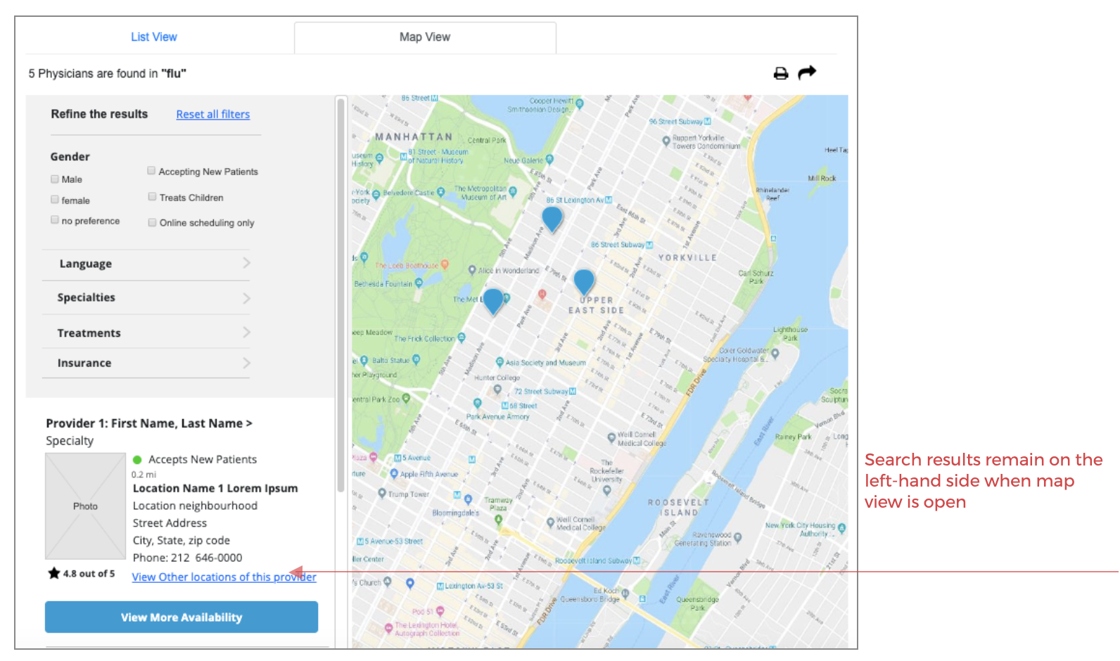
Users may pre-filter search by (and/or):
Specialty
Location
Insurance
New/existing patients
Auto-suggestion implemented - very important for accurate and efficient medical terms entry
Auto-correction
Recognition of root words
Predictive text
Autosuggestion appears after 3rd character
Less then 10 items suggested
Keyboard navigation integrated
Differentiation between "specialty" and "physicians"

Search Results
For optimized view on mobile:
1. Filter collapsed into a button at the top right of the screen
2. Map view is hidden and can be accessed with the help of the "view search on the map" link
3. Time slots are hidden and can be accessed with a help of "view availability" link. The link opens modal with time slots per location
search results: Mobile
RESULTS
Online Scheduling received $2.2 million in revenue 1 year post-launch
Traffic to WCM’s Patient Care site received a 150% increase in new customers to WCM, realizing a 20% conversion rate goal.
Book an appointment conversion went from an average of 15 minutes on phone to under 5 minutes.
Booking appointments process reduced from 7 to 3 steps.
LESSONS LEARNED
Despite initial opposition, creating user stories was highly valuable for the broader team to collaborate, practice user-centered design, and define functionality.
Documentation is essential for ensuring all players are communicating.
Quality control is complicated with outsourced dev and QA resources.
Users don’t typically read content — especially during testing. Therefore, it’s essential to keep UX writing as concise as possible.
User testing only captures happy paths, not all scenarios that generate friction.

CASE STUDY: MAYA MOBILE APP

Overview
GOAL
To build a mobile application for the Department of Psychiatry so that they can administer a research study with recruited patients on the effectiveness of a self-managed anti-anxiety therapy via an iOS mobile platform.
CHALLENGES
A mobile app of this size had not been attempted previously for a clinical use. This required a lot of R&D on both security, HIPAA and for a user that had a known cognitive ailment. The space for such apps was saturated and we also wanted to see what could be learned from those apps in developing a more complete solution.
AUDIENCE RESEARCH
The research stage was extremely important for this project because we had very little information on what are the most preferable features in anxiety and depression-related apps. We couldn’t change the therapy itself but we needed to understand how to convert the therapy digitally and make it interesting for young people so they can stay engaged even after they finish their therapy.
Competitive Analysis:
Objectives for competitive analysis:
Identify products offered by competitors
Analyze features in competitors apps
Gather user feedback on competitor apps
Consider integrating some of the competitors’ features into our product
Popular apps targeted for users with stress and anxiety:
Headspace
Calm
Way of Life
Feature Catalog
Transparency of time: a user will see how long it will take to complete a task, to watch a video etc.
Mood tracker/exposures: an app will allow you to track your emotional state and record it so you can analyze it later.
Overall user progress: a user will also understand how long it will take to complete a task, a session, a week of therapy.
Personalization/Goal settings: the experience will be tailored to a specific user’s goal and each user will have a unique experience depending on their needs
Misc. educational features: a user will have access to continued education, video and audio recordings.

USER FLOWS

The user flow was documented via several ideation sessions. This, balanced with the business requirements, allowed us to build a series of functional requirements that would allow us to move into prototyping.
IDEATION

At this stage, we had the content of each week from our stakeholders and we went through series internal whiteboarding sessions. Our goal was to transfer real-world experiences of patient-doctors to a digital experience app (that represents the doctor) – the patient.
PROTOTYPING | Usability Testing
We wanted to know if our users understand how to use and navigate within the app, especially main menu
I met with prospective users of the app — early young adults, ages 18-22, and ran them through a low fidelity prototype that I designed and linked via InVision.
I identified areas of confusion and presented to the team for review.

FINAL DESIGN SAMPLES

PUBLICITY | SUCCESS
• The Maya app was introduced at the First-Ever National Conference on Medical Students Mental Health: "One of the innovations presented on the first day was the work of Dr. Francis S. Lee, chair of the Department of Psychiatry at Weill Cornell Medicine and psychiatrist-in-chief at NewYork-Presbyterian/Weill Cornell Medical Center, who demonstrated his digital cognitive behavioral therapy (CBT) app designed to help teens and young adults learn behavioral skills to address their anxiety and depression"
• Link to the article: https://news.weill.cornell.edu/news/2019/09/weill-cornell-medicine-hosts-first-ever-national-conference-on-medical-student-mental
• The Maya app was featured on the PBS Special on 9/25/2019 by New York-Presbyterian's Youth Anxiety Center Program Director Dr. Avital Falk, Ph.D